無標題文件

為快樂找一種顏色 - A happy house
This designer played with colour to create a unique, fun and vibrant home.
今次,帶讀者們走訪的這個炎炭駿景園的單位,正好示範了如何深淺成對,對出一幅叫人看得舒舒服服的畫面來。


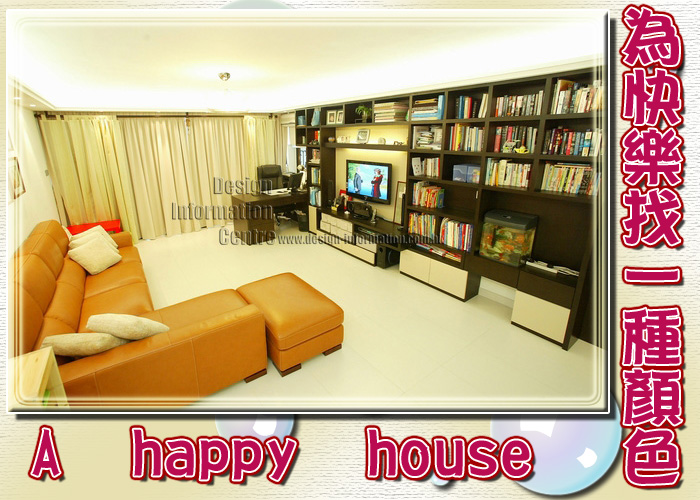
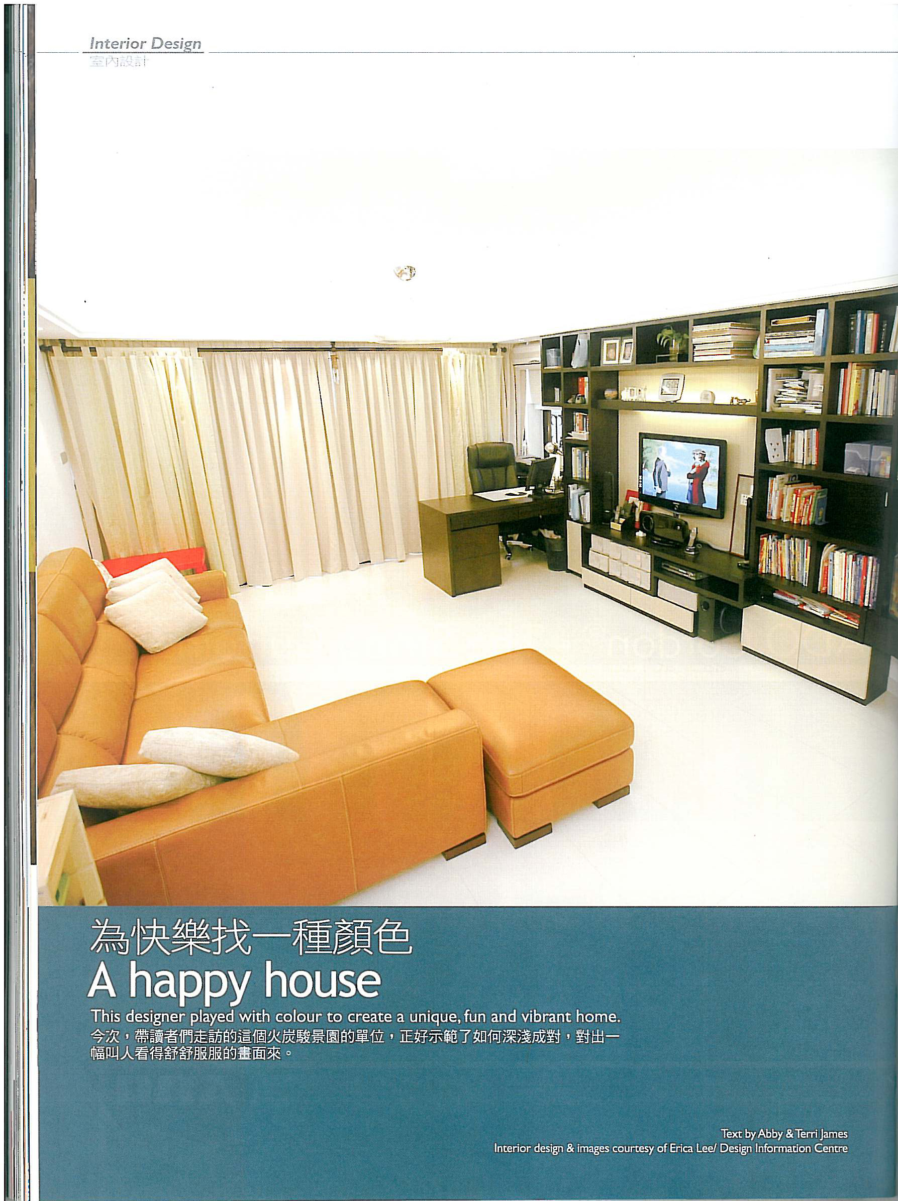
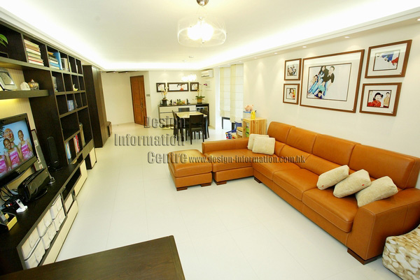
與木櫃正對的,是曲尺形橘色沙發,搶眼。但主角卻是擔起了調和氛境和突出周邊色彩的那堵髹了奶油色的牆。
The burnt orange, leather sofa adds a splash of vibrant colour to the room.

深淺相對,柔和舒心。
The dark wood gives the room warmth.
,有些人可能覺得色彩要搶眼奪目,才不枉將之髹在牆壁上。但這麼一種做法,要考慮居室的佈置、建材和光線。沒錯,色彩夠炫目的話,很能抓住人家的注意力,眼裡沒有別的,只有紅啊金啊黃啊……可是居室家具飾建材如以深色木材為主,請你先幻想一下那場景,是否會有弄巧成拙的負面效果呢?所以,有經驗的設計師都會利用對比,深中有淺,淺中有深,將色彩、家具和建材等,搭配調和出叫人看得最舒服的效果。不是要你放棄鮮豔色彩,而是要搭配得宜才成。
舒心之色
甫進屋內,即看到設計師一手執深色木建材,一手拿淺色顏色料,深淺想對,柔和舒心。一長列以方格組成的深色木材陳列兼影音組合櫃,圍滿了廳區一堵牆。一個又一個方格裡,放了書籍魚缸飾品文件。櫃的旁邊,近窗位置,擺放了一張大書桌,便利屋主處理公事私務。

廳區面積寬敞、佈置簡潔不花俏,屋主也沒有刻意追求什麼豪門大宅的氣派,就連枝形水晶吊燈也欠奉,反而,選用了滲光假天花和造型獨特的吊燈作照明。說到生活機能,只要看到廳區那長列木櫃,已知收納空間一定很充裕。與木櫃正對的,是曲呎形橘色沙發,搶眼。但主角卻是擔起了調和氛境和突出周邊色彩的那堵髹了奶油色的牆。壁上,掛了屋主一家快樂留影,溫馨。這抹「淡妝」,跟深色木材各據一方,分庭抗禮,也消弭了木材之沉實帶來的壓迫感。而地鋪之白磚,其素雅之姿,也正好跟素壁組成明亮廳堂的理想搭檔。


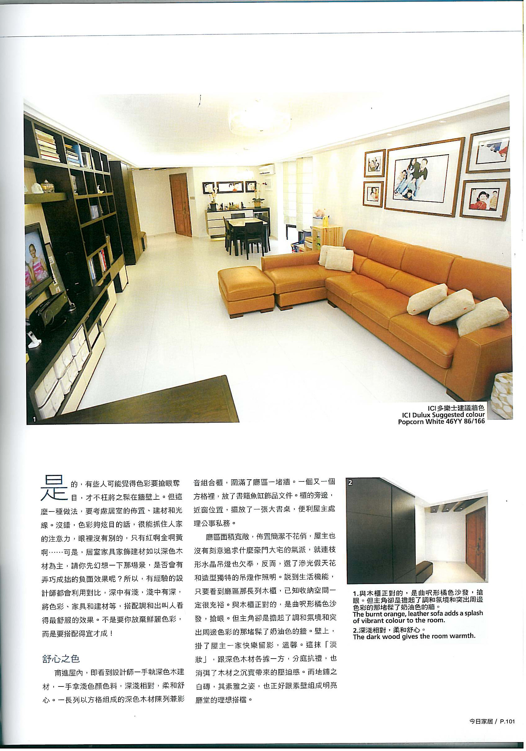
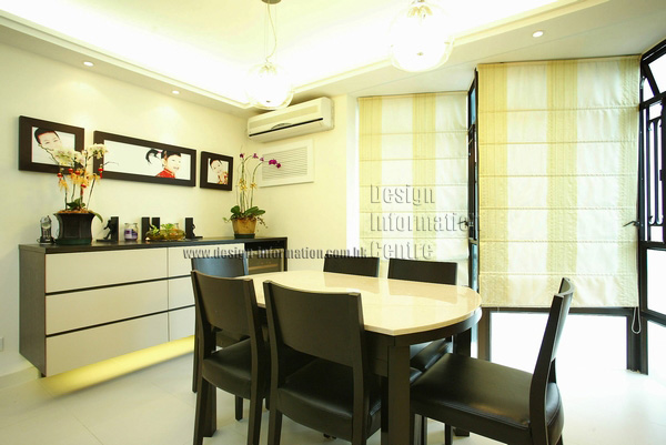
選了滲光假天花和造型獨特的吊燈作照明,如此柔和的燈光,很能突出餐桌黑白之色。
Two glass pendant lamps hang above the black and cream dining set illuminating the table.

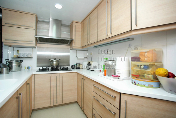
廚房收納空間夠,每次買個滿載而歸,都不怕沒地方擺放東西。

The kitchen has lots of cupboards for mum to put away food after a family shop.

藍天伴著,夜夜酣睡
主臥沒有奶白,卻有酷藍,是設計師為了營造輕鬆的氣氛而挑的色彩。那藍,是天空的藍。色自然,叫人看著舒心不已,倘若要找一種顏色伴著自己入眠,天藍會是上佳之選。淺藍又帶幾分冷感,於是設計師就以帶暖感的紅木來造家具家飾,調節室內「溫度」。

走到孩子的房間,色彩如何搭配如何挑,繼續是個令人好奇的話題,是的,孩子臥室該有一種主顏色,既突出了此間及少主的房間同時,又能夠讓孩子看著開心。設計師用了粉紅粉藍來包圍睡床,這淺淡色調能讓人靜下心來,是「哄」小孩入睡的理想色彩啊!而另邊廂的黃色及儲物櫃上的點橘點綠裝飾呢,就是為了刺激她們想像力的而設的。一個房間,兩種情調,有動有靜,就如孩子的愉快生活,妙趣!


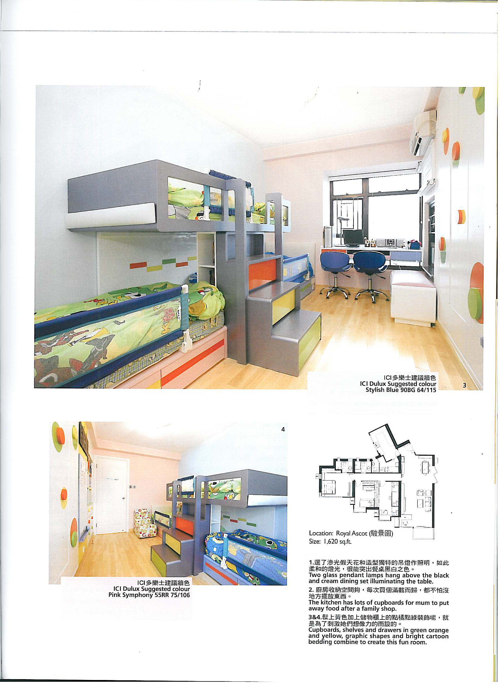
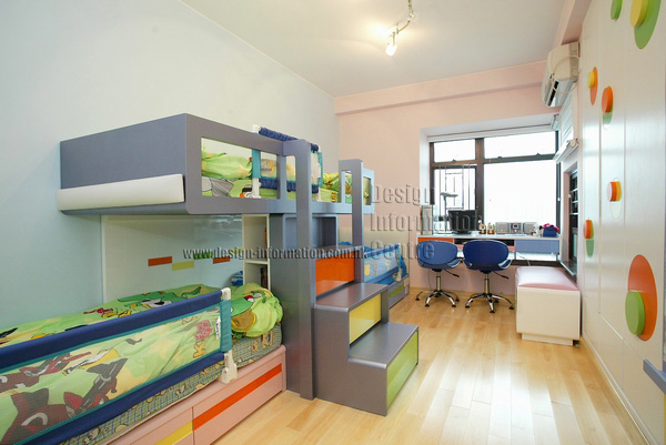
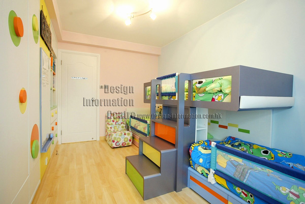
髹上黃色加上儲物櫃上的點橘點綠裝飾呢,就是為了刺激他們想像國的而設的。
Cupboards, shelves and drawers in green orange and yellow, graphic shapes and bright cartoon bedding combine to create this fun room.

Colour is truly a magical property. It can transform an environment, create a style, set a mood and alter perceptions. There are many different ways to introduce colour into your home; for this apartment the designer used coloured wall paint, coloured tiles, brightly coloured furniture and lots of wall art to create a happy and energetic home full of life and fun.
Buttermilk
The family room is a large, bustling room that accommodates the varying needs of the whole family. As this room was going to be filled with lots of colourful items, the designer chose a pale buttermilk wall colour as the base for the scheme. Creamy with just a hint of yellow the colour is cheerful yet neutral enough to combine with all the other colourful elements. A larger wall unit in dark wood covers one wall and incorporates bookshelves, drawers for storage, shelves for the TV and audio equipment and a desk and workspace. The dark wood gives the room warmth, but the contrasting cream drawers ensure the unit maintains a light-hearted feel. The burnt orange, leather sofa adds a splash of vibrant colour to the room. The dining area has another built in unit; this one is wall mounted and lit from underneath to keep the area bright and spacious. Two glass pendant lamps hang above the black and cream dining set illuminating the table. The walls are decorated with cheerful family portraits of varying sizes in matching wooden frames.
Cool blue
For the master bedroom the designer chose a relaxing, cool blue for the walls.
The colour of the sky, blue is natural and calming and this cool, pale shade has a soothing effect that helps induced sleep; the perfect bedroom colour. As pale blue can be a little cold the designer used a warm ruddy wood for the fixtures and fittings adding warmth and giving the room a cosy, inviting feel.
Pretty pink and baby blue
The colour scheme in the children's room is very well thought out. The designer used pastel colours around the bunk beds.
Pastels are calming and soothing they won't over stimulate, so they are ideal for helping the children to get to sleep. When the children are out of their beds, vibrant colours that stimulate their crativity and imaginations surround them. Cupboards, shelves and drawers in green orange and yellow, graphic shapes and bright cartoon bedding combine to create this fun room.
The children’s bathroom is an equally fun place with bright yellow floor tiles, blue cupboards and multi-coloured wall tiles, making bath time a treat.


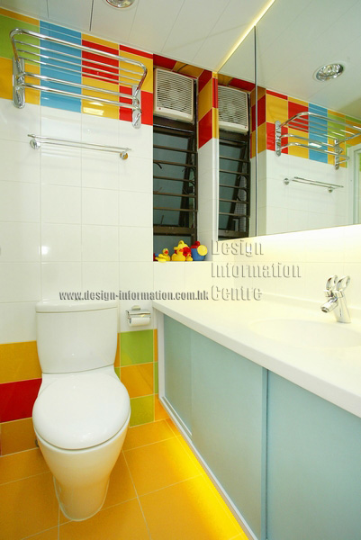
孩子的衛浴間,色彩繽紛,鮮黃地磚很搶眼,很能營造愉快氣氛。藍色的櫃和多色多彩的牆磚,又令孩子看著歡喜,是的,不少孩子都討厭洗澡,可是,看著這麼一個像遊樂場的地方……
The children’s bathroom is a fun place with bright yellow floor tiles, blue cupboards and multi-coloured wall tiles, making bath time a treat.

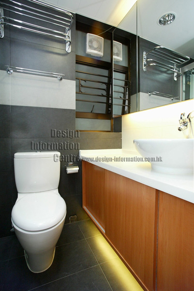
客廁格調摩登,佈置素雅,建材以木為主,搭配灰牆磚,素淨耐看。


Grey wall tiles and wooden fixtures make the guest bathroom stylish and sophisticated.


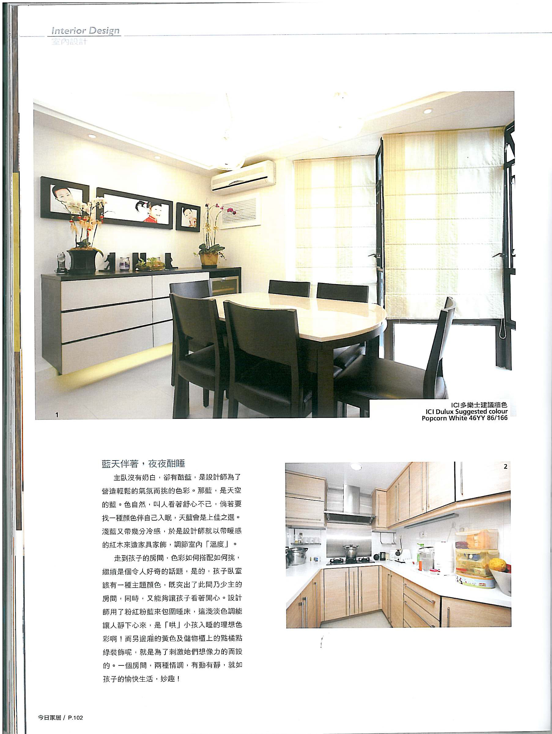
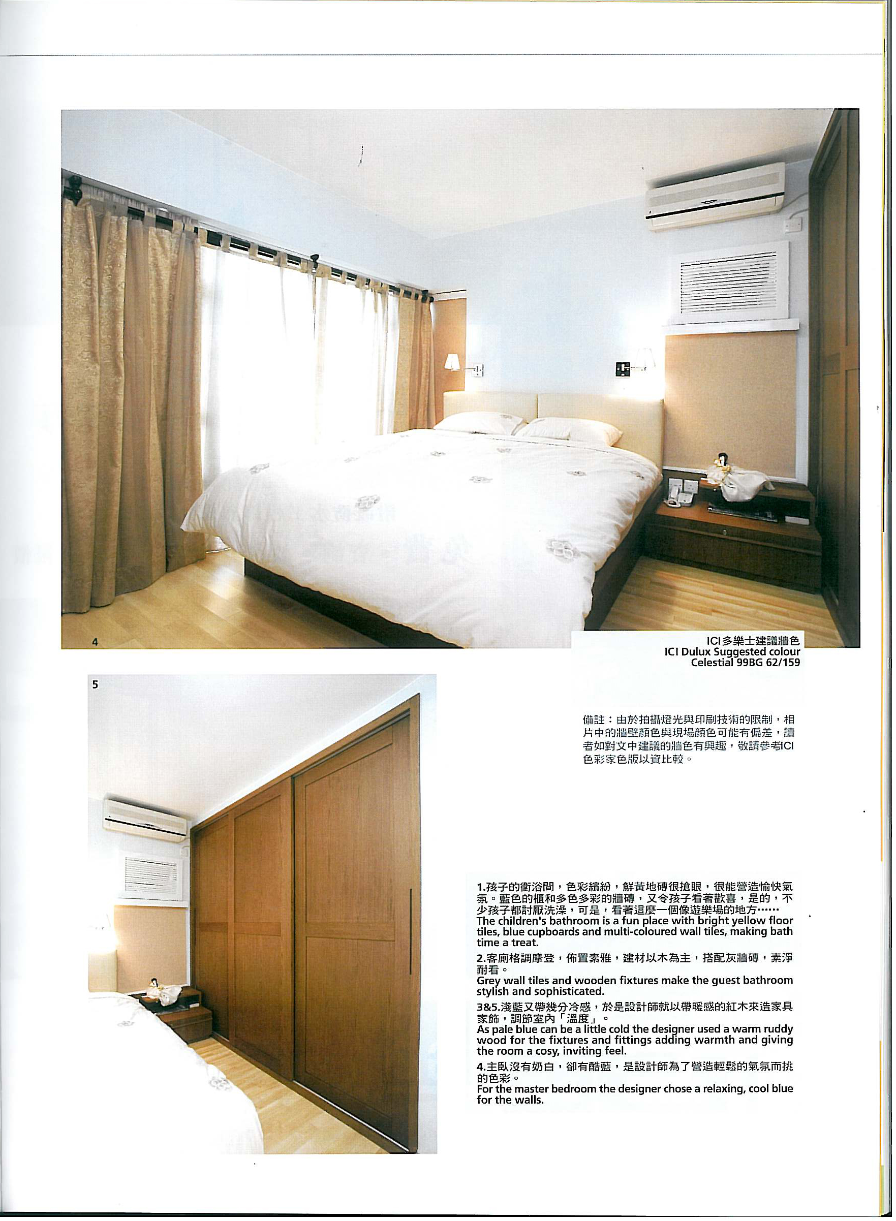
淺藍又帶幾分冷感,於是設計師就以帶暖感的紅木來造家具家飾,調節室內「溫度」。
As pale blue can be a little cold the designer used a warm ruddy wood for the fixtures and fittings adding warmth and giving the room a cosy, inviting feel.

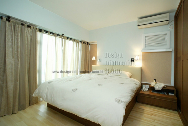
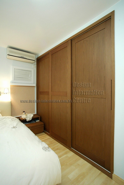
主臥沒有奶白,卻有酷藍,是設計師為了營造輕鬆的氣氛而挑的色彩。
For the master bedroom the designer chose a relaxing, cool blue for the walls.

鳴謝今日家居 第239期資料轉載